The USA charts are based on data from the National Oceanographic and Atmospheric Administration (NOAA).
- See the official NOAA Index of /data/normals-daily for the raw (not human-readable) data.
- Also see NOAA 1991-2020 Daily Climate Normals Data, an SQLite3 database I created and put on GitHub. It contains most of the data found in this site.
- There is a lot of climate data publicly available on the web, but it can be hard to find, and it moves around over the years. Try 'climate normals' as a starting point for searches for the kind of data shown here.
Other countries are based on data from World Meteorological Organization (WMO).
Reading the Charts
Each chart makes it easy to see how climate for a particular location changes over the year, and how climate varies between locations.
All the charts use the same scales, for easy comparison between different locations. The scales fit the extremes of the data, although for a few stations (less than 1%) the values are truncated to fit the top of the chart section. The tables below the charts show the un-truncated values.
Most of the USA data is daily averages. Most of the WMO data is monthly averages.
Precipitation includes rainfall & snowfall.
Each chart is in three sections. Here we show each section (reduced in size), working from top to bottom, and explain what it contains.
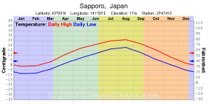
Top Section: At the very top each chart is titled with the name of the location of the weather station where the data was gathered. Below the title you can find the latitude, longitude, elevation (where available) and the NOAA/WMO station id.
Next the months are listed, each given space proportional to the number of days it has, although that is hard to see.
The temperature section is next. High and low temperature is shown with red and blue lines, respectively. Average temperature (shown when highs and lows are not available) is green. A Centigrade scale is on the left, and a Fahrenheit scale is on the right.
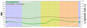
Middle Section: Precipitation is shown in this section. Not all stations have all precipitation data.
Rainfall is displayed in millimeters on the left and tenths of an inch on the right.
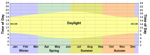
Bottom Section: Daylight is shown by the yellow area, with a time-of-day scale on both sides. Time goes up on the scale, the the bottom edge of the yellow area represents sunrise, and the top edge represents sunset.
The amount of daylight is determined by the latitude of the location. However, the precise time of sunrise and sunset also depends on longitude and time zone. I don't have an automated way of matching longitudes to time zones, so the rise and set times are approximate. If the times were precise, the yellow daylight would be the same size and shape, but moved up or down in the chart a little bit. Also, daylight savings time would cause an offset while it was in effect.
The month labels are shown again, then the seasons are are labeled and shown with a tinted background that extends up the chart. Seasons for the southern hemisphere are reversed from the northern hemisphere - i.e., when it is winter in Europe it is summer in Australia.